
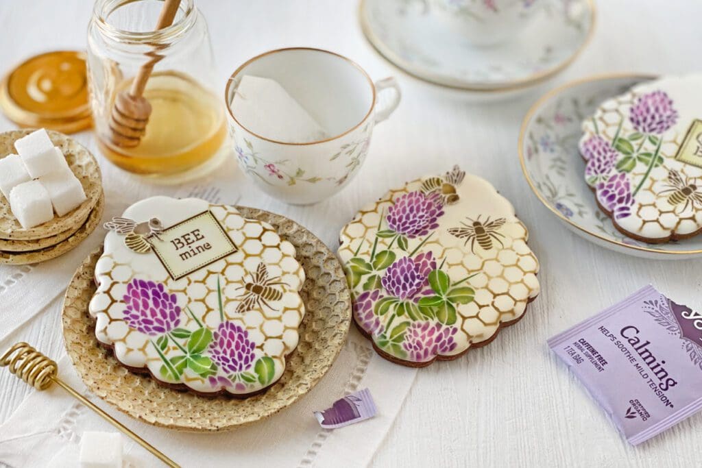
Whether for a belated Valentine’s Day celebration or any other day of the year, my February 2022 Dynamic Duos™ release is the perfect way to tell your loved one (or secret crush) that you care! With charming clover and bee background designs and messages such as “BEE mine”, “SWEET as can BEE”, and “MEANT to BEE”, these sets are sure to convey all the important sentiments.
See what I mean?
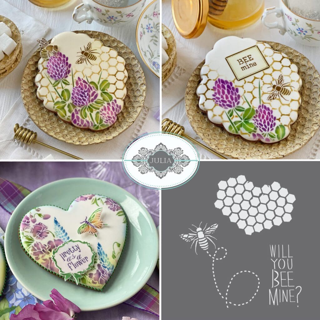
Wondering where to find the stencils to make the beauties in this release?! I thought you might bee (pun intended! ![]() ), so here you go:
), so here you go:
As always, the background stencil in the background set (the honeycomb shown to the far left in the image below) is sold separately and can be found under Vintage Honeycomb Dynamic Duos™ Background Cookie Stencil on my partner’s site.
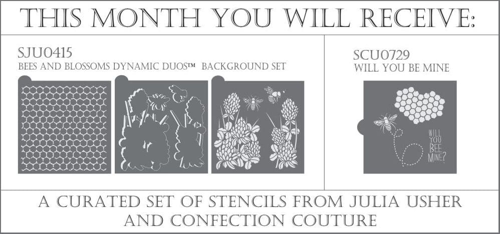
Now, for a PSA about my Stencil of the Month Club. Long story short, if you’re a stencil hoarder ![]() (and even if you’re not), it’s one of the cookie community’s best deals! If you join my club, each month you’ll automatically get the current month’s background set along with my partner’s single companion stencil, all at a substantial (>15%) discount! Not only that, but as a member, you get 15% off anything else on Confection Couture Stencils’ site whenever you’d like.
(and even if you’re not), it’s one of the cookie community’s best deals! If you join my club, each month you’ll automatically get the current month’s background set along with my partner’s single companion stencil, all at a substantial (>15%) discount! Not only that, but as a member, you get 15% off anything else on Confection Couture Stencils’ site whenever you’d like.
Here’s a look at this month’s Stencil of the Month Club offering:
As you may or may not know, I also launched my own cookie cutter line back in 2021. The cutters are super durable yet also have a stepped cutting edge, meaning that the side wall is thicker (and therefore sturdy) at the top and very fine at the bottom so you get ultra-precise and clean cuts. This month as always, I’m also releasing a cutter designed to go with my Bees and Blossoms sets . . .
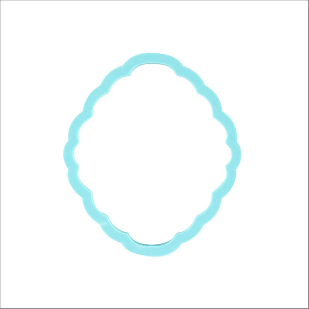
This cutter is called the Beekeeper Bryan Plaque, and is named after my honey of a husband for very good reason. Just say the word “bee”, and I immediately recall the time he – a fledgling beekeeper – asked me to call the police to warn passersby about his swarming bees. Turns out the queen bee flew her hive, sending the rest of the bees into a tizzy. Bee-raising in our household has since calmed considerably (phew!), leaving me to focus on more pleasant tasks – such as how to incorporate the-best-honey-ever into cookies! Spawned out of gratitude for my husband’s new honey-making skills, this beehive-inspired cutter frames this month’s sets beautifully. However, its soft curves and ample decorating space make it a great universal cookie shape. I used the large (4 1/8 x 4 3/4-inch) version in the photos throughout this post, but the cutter is available in two smaller sizes (4 x 4 1/2 inches and 3 3/4 x 4 1/4 inches).
So those are the stencils and cutter that I’m releasing this month, but how does one use them? Good question! I’ll start first with a style reel that shows some of the many design variations possible with the two sets in this release. The second video then shows, in hyper time-lapsed format, how I put one of those designs together using the innovative masking and layering concepts unique to my stencils.
Need more info? Then read on, as I’ll be sharing several designs using one or the other, or both, of the sets that make up this release. Remember, each of my monthly releases contains a background set with all of the pretty pictures (in this case, the honeycomb, clover, and bees) and another one with messages and frames that can be layered on top.
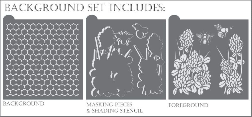
This set has a relatively small number of foreground elements (just four), making it a great beginner set. The clover flowers are also fairly large, meaning that you can get a lot of lavish design detail without having to use loads of stencil elements or layers. But before we look at those foreground elements, let’s see what the honeycomb background stencil looks like on its own. Remember, it can be purchased separately via this link, Vintage Honeycomb Dynamic Duos™ Background Cookie Stencil.
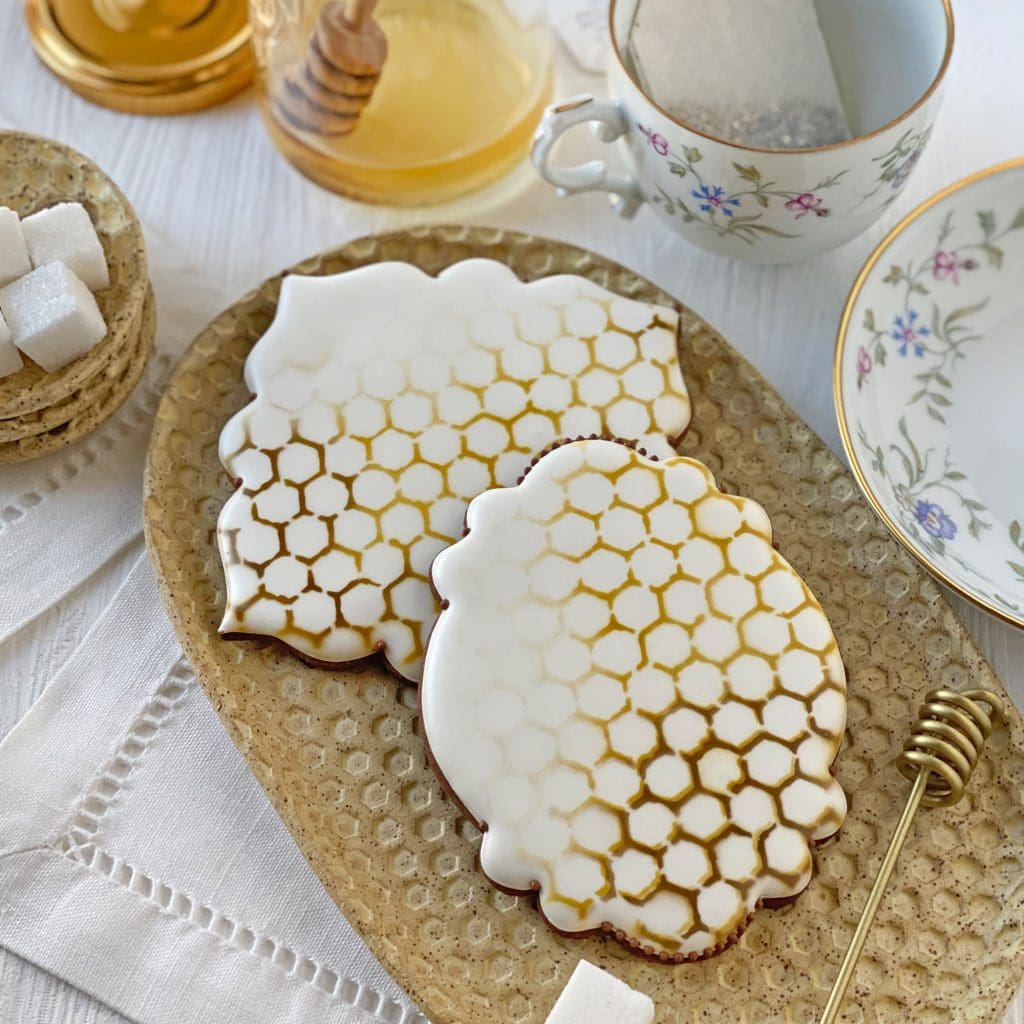
For both cookies above (and for most of the cookies in this post), I chose to cover just a portion of the cookie with the background stencil. I tend to prefer some empty space on a cookie when both the background stencil and foreground elements have a lot of detail; it gives a little resting space for the eyes! I also didn’t bother to mask (or cover) the portion that I didn’t want to fully airbrush, as I wanted a gradual fading away of the honeycomb into the void.
As you can see in the above photo, I added interest by airbrushing the honeycomb in two colors: gold (about a 9:1 blend of AmeriMist Gold to Chefmaster Brown) and Chefmaster Brown. But what may be less obvious from these photos is that I applied the brown a little differently to each one.
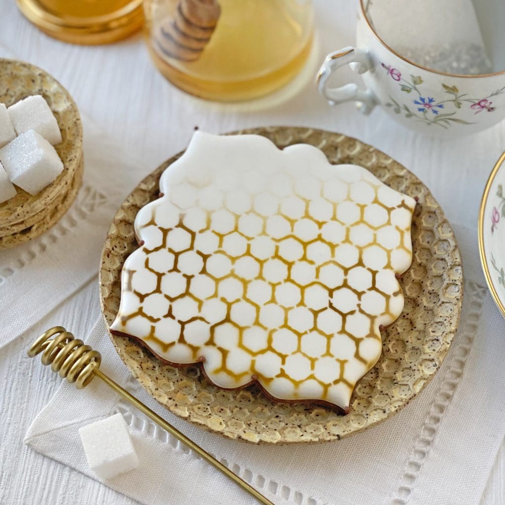
In the photo above, I didn’t move the stencil between applications of color. I put the gold down first and then airbrushed over the gold in a few spots with brown, hoping to suggest some of the natural color variation you’d see in real honeycomb.
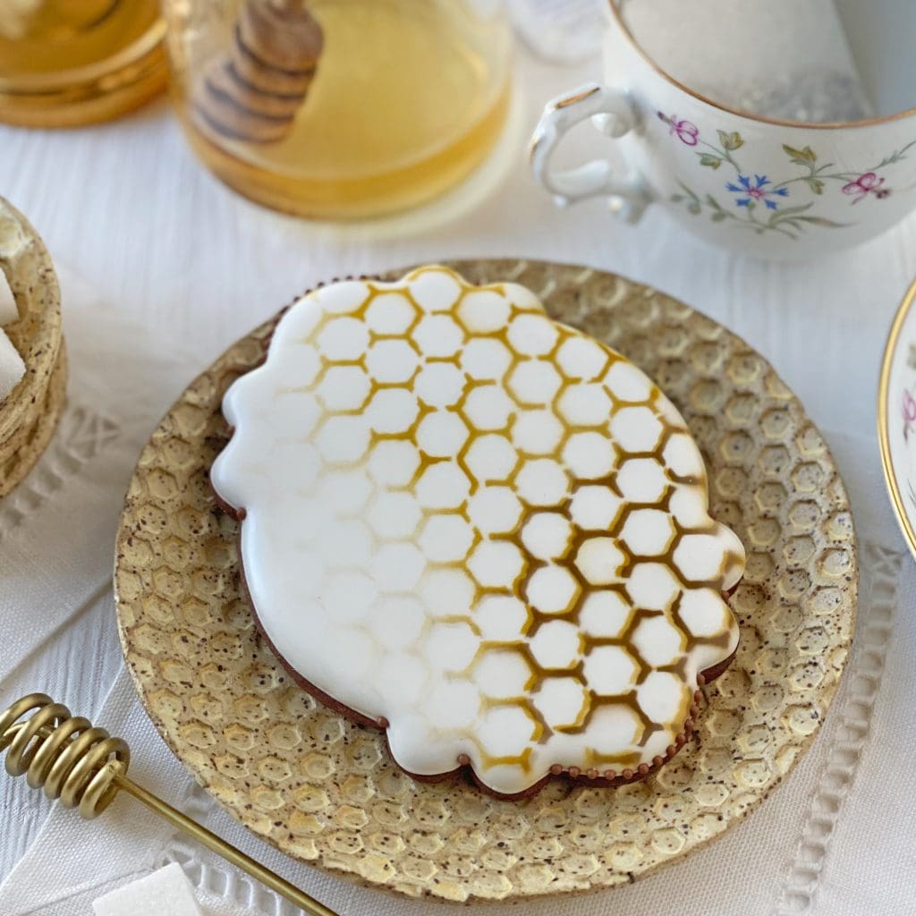
For the cookie above, I wanted to give the honeycomb a greater sense of depth so I phase-shifted the stencil between colors, making sure that the patterns still overlapped a hair. The areas where brown and gold are side-by-side do have the illusion of more dimension, but, at the end of the day, I opted to keep the background stencil in one place. Since the honeycomb colors I chose are relatively dark, I decided that a simpler stenciling treatment would be less likely to compete with the foreground clover and bee elements.
Speaking of those elements, let’s add some! Here’s a small cookie with both the honeycomb and the smaller of the two clover flower bouquets . . .
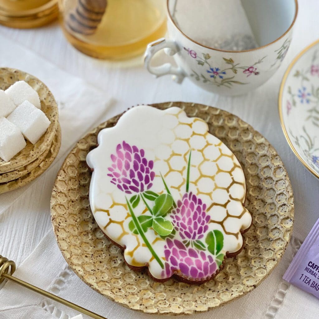
This cookie also has the added surprise of a small dimensional pair of leaves that was airbrushed and stenciled on wafer paper, cut out, and then adhered to the cookie with a dab of piping gel. (Aside: It may be hard to tell from these photos, but I used six AmeriMist colors on the clover flowers and leaves: Electric Purple, Regal Purple, and Deep Pink for the flowers, with the darkest purple concentrated along the sides and base of each flower; and Electric Green, Avocado Green, and Leaf Green on the leaves, with the two darker greens used to accentuate the veins and leaf edges.)
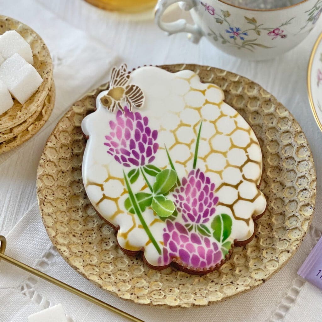
For a little more dimension, I added a honeybee in the form of a fondant appliqué . . .
For some of the cookies, I played with dimension in another way, with a new medium (at least new for me, that is). That medium was glutinous rice paper, which comes in thin, translucent wrappers, and, ironically, has only corn starch and tapioca starch in it per the product label. (What’s even more ironic is that the Amazon link, above, says it’s comprised of potato starch despite the product packaging saying otherwise!) Anywho, coming out of the package, “rice” paper is much more translucent, shiny, and flexible than wafer paper, but it will eventually dry out to the point of shattering with a light touch.
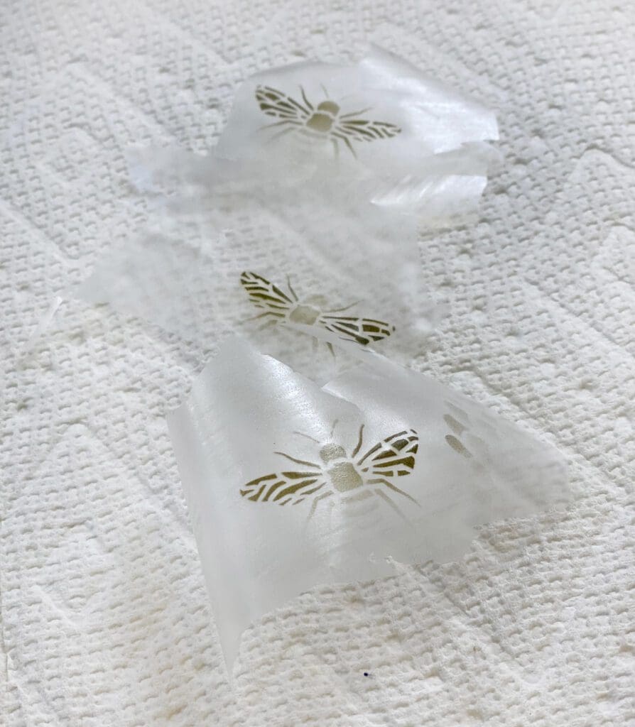
I love its sheerness and shininess though and thought it would be perfect for bee wings (which it was). I started by airbrushing and stenciling several sets of bee wings onto rice paper sheets . . .
I then cut them out ever so carefully and stuck them onto bee bodies that had been airbrushed directly on to cookies. I didn’t want to see two sets of wings on each bee (!), so I was careful to block out the wings when airbrushing the bees on the cookies. Here’s the result on one cookie:
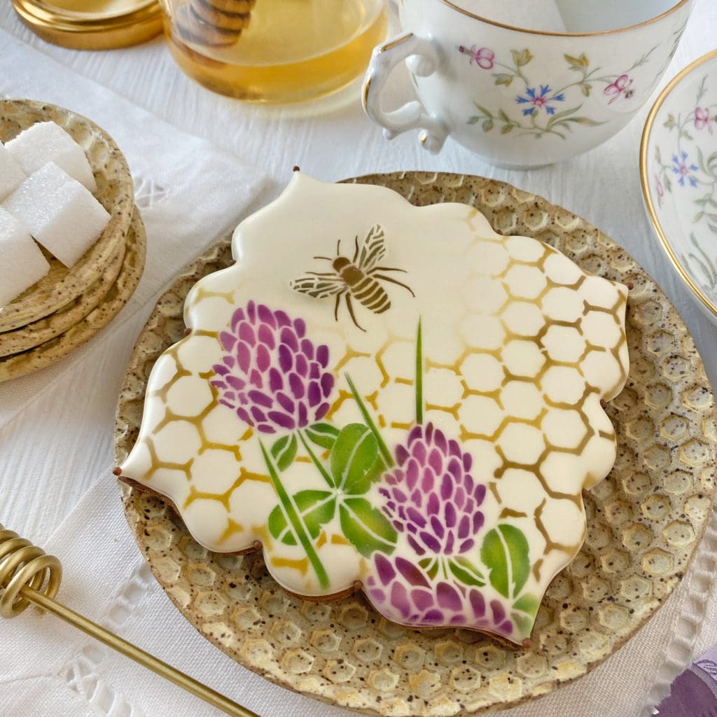
Unfortunately, my lighting and angle in the above shot don’t really do the wings justice. You’ll have to trust me when I say they were shiny and lifted one-quarter to one-half inch off the cookie in a very lifelike flying position! This closer view will perhaps give you a better sense of how the wings looked in person:
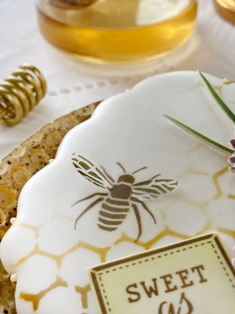
Photo quality aside, I am definitely a glutinous rice paper convert, and I expect to be exploring other ways to use this fun medium in the future. (Stay tuned!) Now back to the cookies. The next few photos show how much flexibility is afforded by using fondant appliqués. Using the background stencil, I made a bunch of fondant honeycomb overlays, and then tried them all out on the cookie two cookies prior . . .
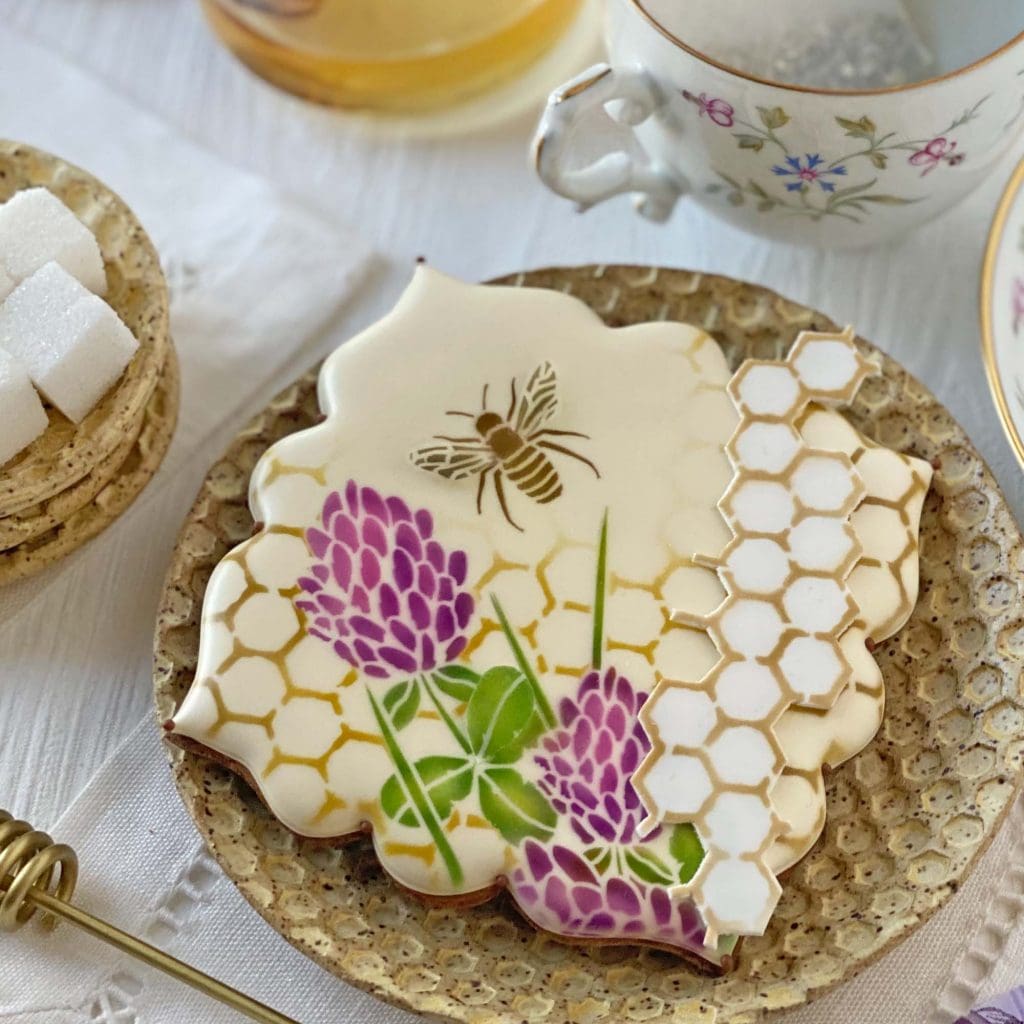
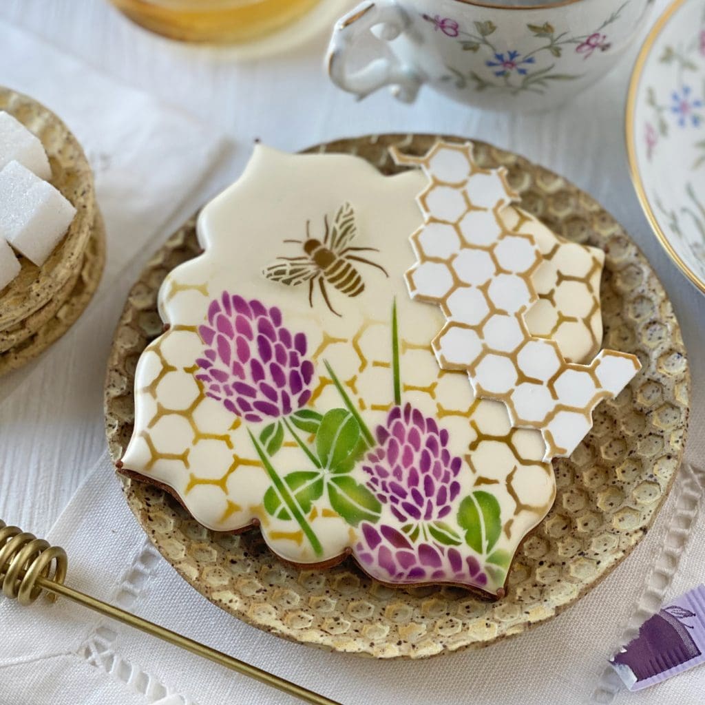
I love how dried fondant can hang off the edges of cookies without slumping; the angular, jutting “shards” make for a rather artsy, avant-garde look.
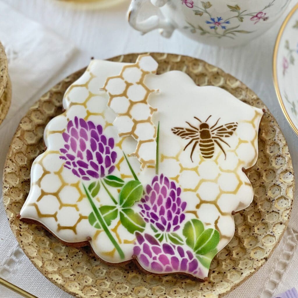
Here’s a version with a white appliqué on a white cookie, instead of the light gold cookie you just saw. That appliqué is also elevated with a touch of white fondant so that it stands out from its same-colored background. Also to note, the bee here is airbrushed in its entirety (including the wings) directly on to the cookie.
Below is the one cookie I made where I covered the entire cookie with the background stencil. I also introduced more dimension to the flowers by layering flower fondant appliqués on top of the flowers directly airbrushed on the cookie.
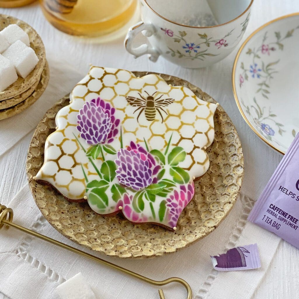
But, as I said, I often prefer to leave a little resting spot for the eyes, as I did below on this cookie made with my new Beekeeper Bryan Plaque cutter.
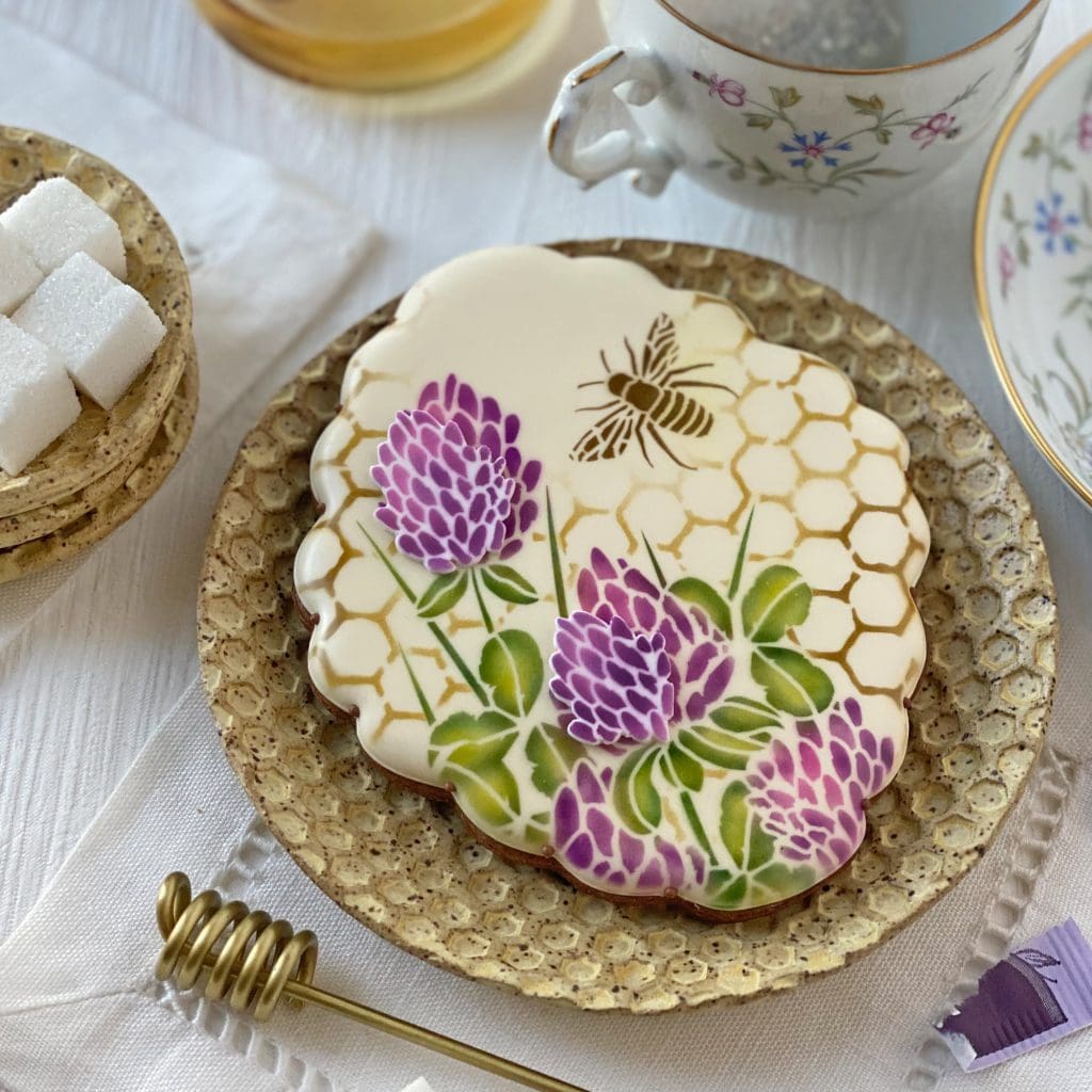
If I do say so myself, this cutter is the perfect shape and size for these sets (but that’s kind of the point of designing them together ![]() )! I couldn’t resist adding another bee after the fact, again a testament to the flexibility of fondant appliqués . . .
)! I couldn’t resist adding another bee after the fact, again a testament to the flexibility of fondant appliqués . . .
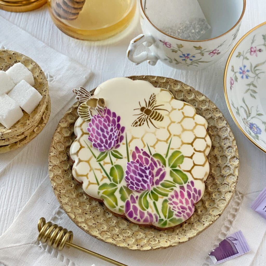
Aside: I’m not sure if you noticed, but the striped bee bodies all have a pale yellow cast to them! Well, that’s because I dusted them (after airbrushing with brown) with compressed yellow petal dust, which is a bit easier than an airbrush to control in tight areas.
Now . . . as you should know by this point, I’m a woman of some words! The background set just isn’t complete to me until I layer on framed messages from the companion message and frame set. Here’s what that set looks like:

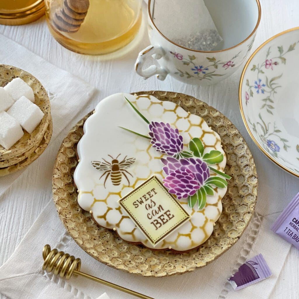
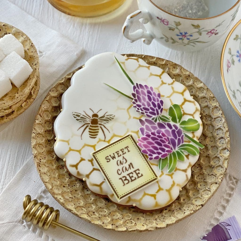
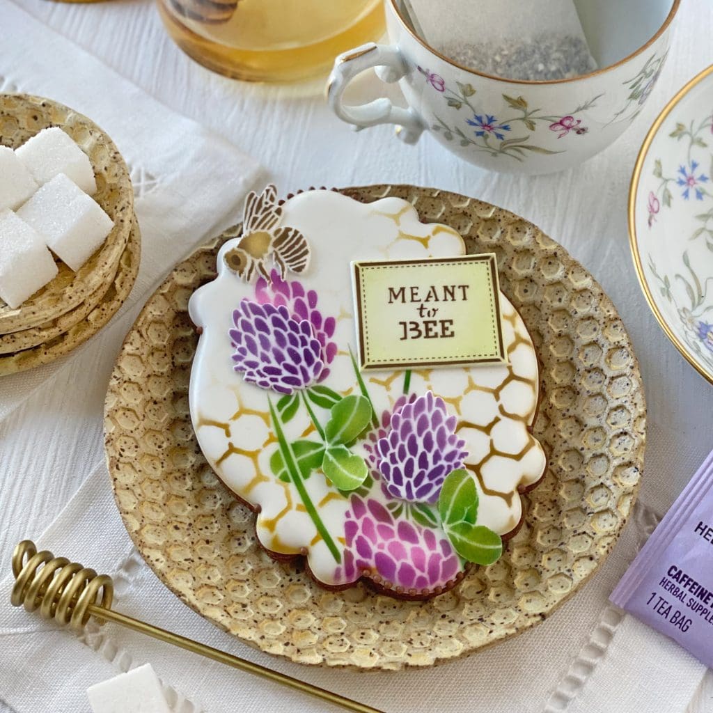
And here are some of the many design variations possible by adding it to the mix! Let’s start first with some cookies made by layering elements on the background stencil-only cookies that I shared at the very start of this post . . .
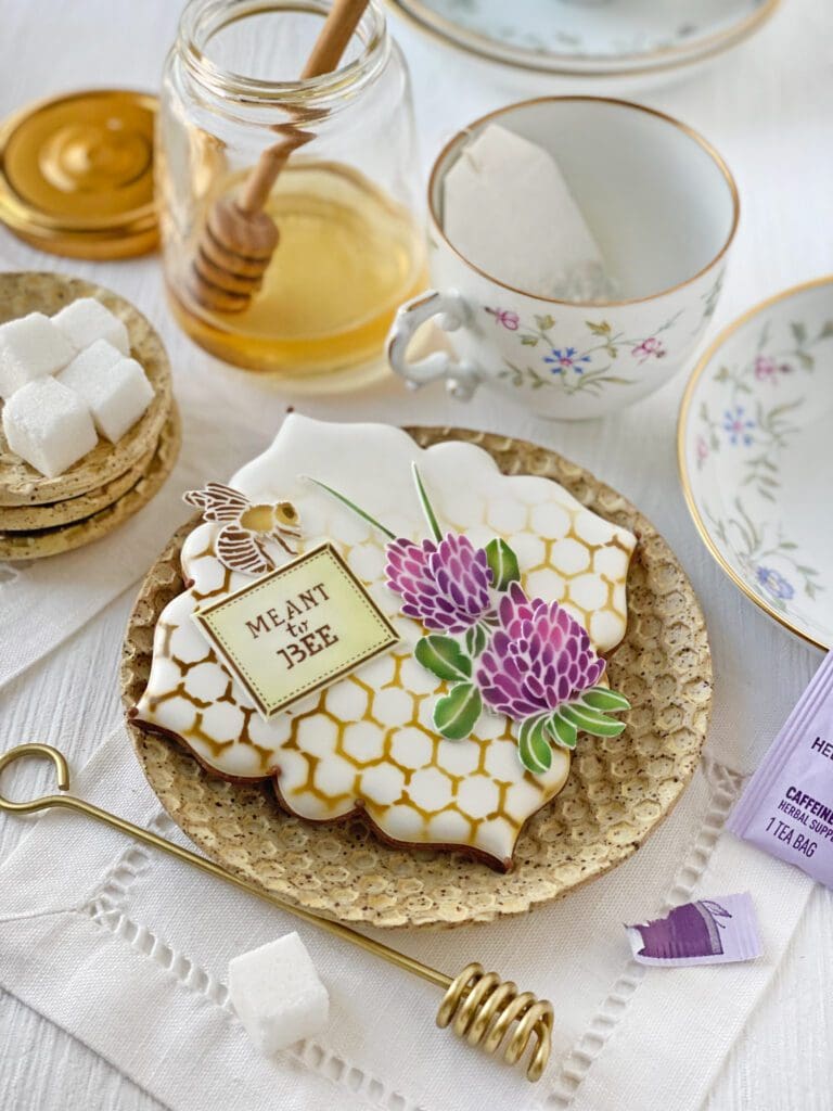
Diversion: I’m a sucker for tableware, both vintage and new, and have quite a stash that started accumulating back when I was styling for magazines for a living. The latest additions to my collection are the golden honeycomb plates and butter pats made by local St. Louis artisan Elizabeth Giessow of Giessow Pottery who sells her work among the carefully curated handcrafts at Union Studio. Their color and texture fit perfectly into this photo shoot! (Though, in retrospect, I’m pretty sure I could have made them out of cookies! I’ll have to do that next time!)
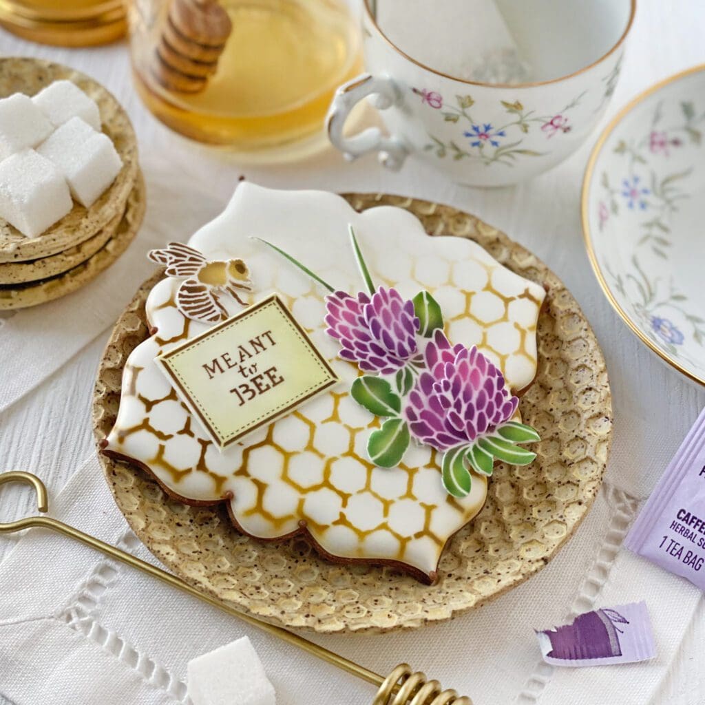
The above cookie is the same as the one immediately before it, just a bit closer so you can appreciate that every item on top, even the clover bundle, is a fondant appliqué. Likewise, this cookie takes the same approach to adding dimension . . .
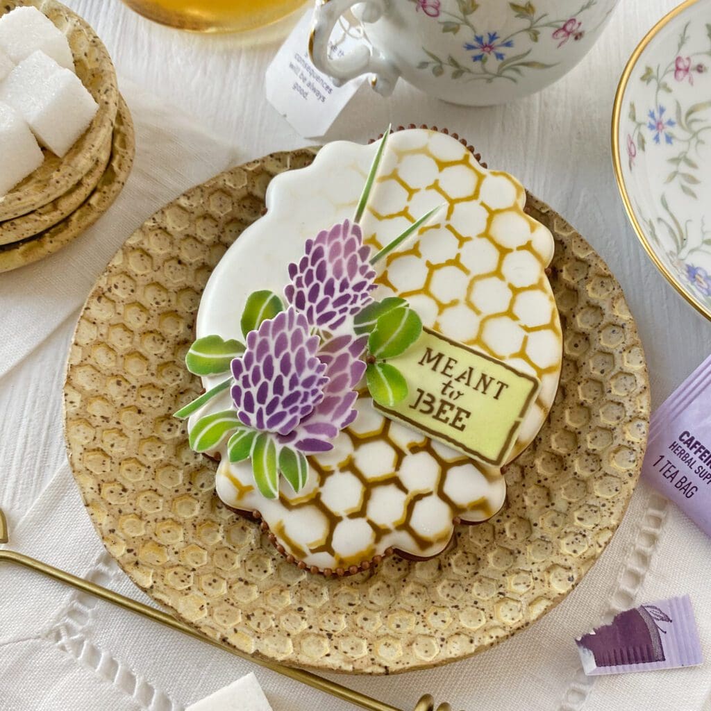
This “MEANT to BEE” cookie also demonstrates how well these sets can fit on cookies of various sizes. The above cutter is fairly compact, whereas Beekeeper Bryan, below, is more generously sized . . .
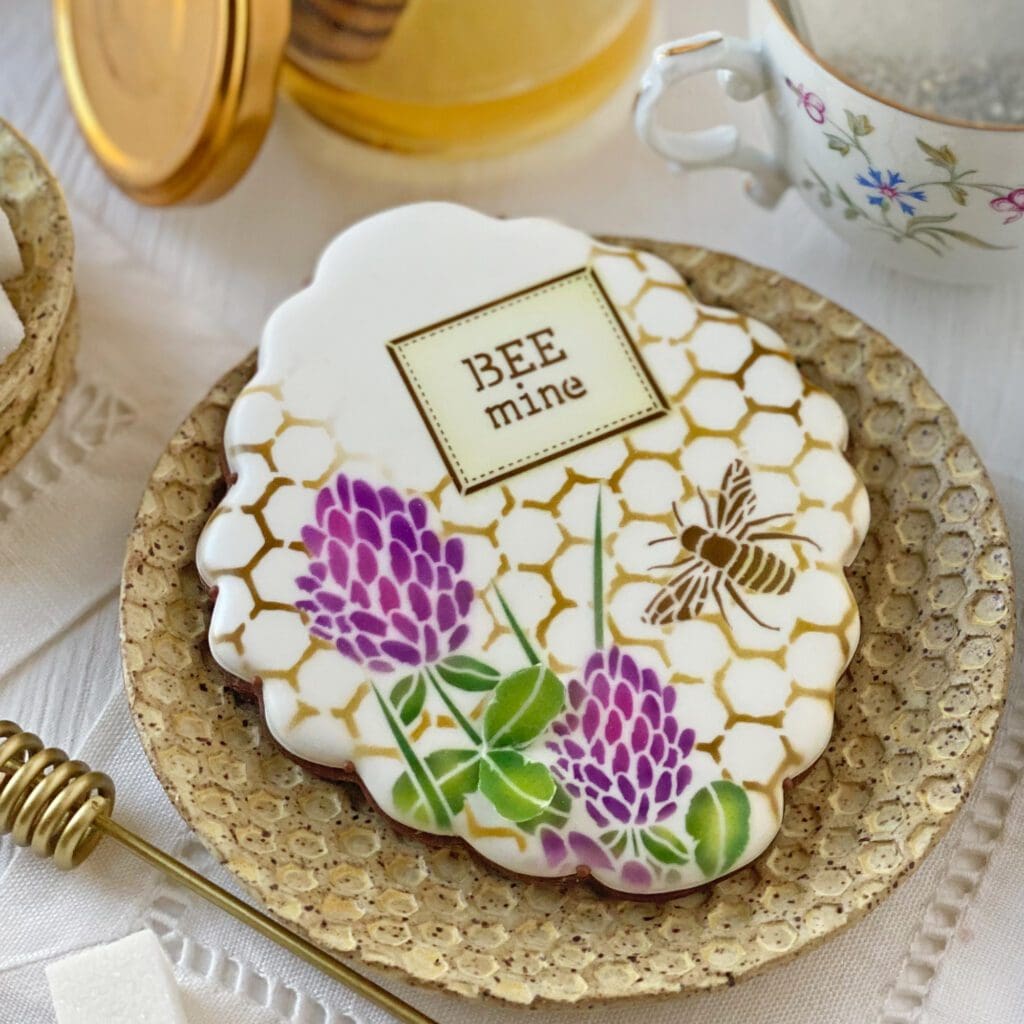
With the cookie above, I started simply by airbrushing all elements directly on the cookie, with the exception of the wafer paper leaf duo that was stuck on top after the fact to cover a small error (and also to add dimension ![]() ).
).
Then, being the more-is-more person that I am, I started jazzing it up. Below, you’ll see the addition of a fondant bee as well as two partial clovers piped with royal icing. Royal icing transfers, like these that used the stencils as a piping guide, are another good way to add dimension to an otherwise flat airbrushed and stenciled cookie . . .
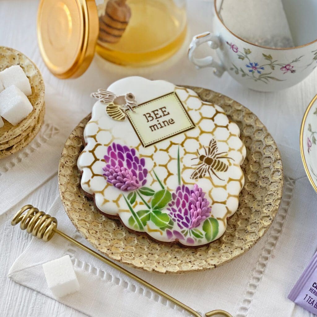
Here’s a slightly different configuration with a bee with rice paper wings!
Yet another view, this time closer in an attempt to show off how sheer and lifelike those wings are. Though my camera skills really aren’t helping much in that regard, are they?
Back to some smaller cookies. If one is careful when planning designs, it’s possible to fit nearly every design element in a compact area . . .
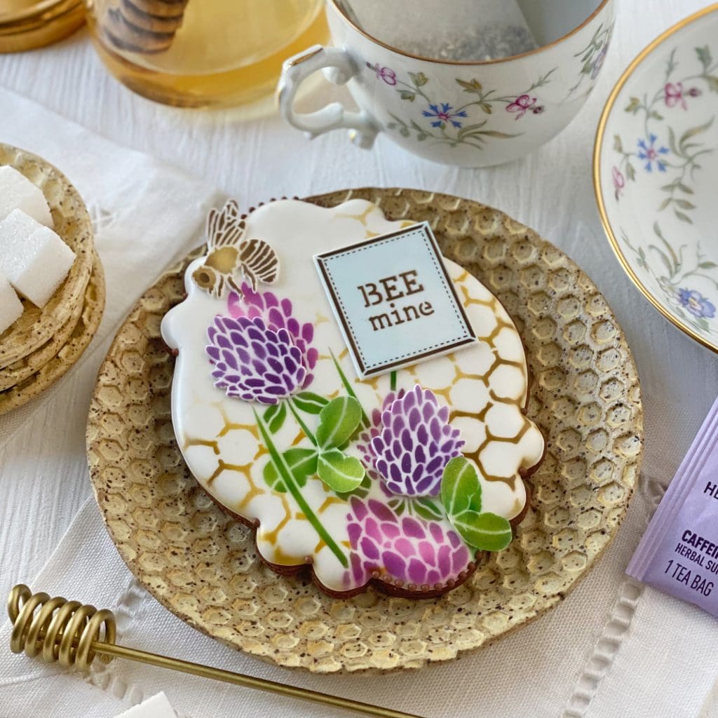
The next two images, once again, demonstrate the versatility and flexibility afforded by fondant appliqués. I was able to swap in various message plaques until I settled on one that I thought looked best.
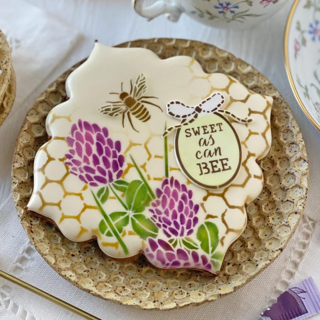
Ooh, before I forget, here’s a cookie shown earlier, now with the oval frame we hadn’t yet seen in action. Because the background and foreground elements in this release are fairly large and complex, I purposely kept the frames very simple. This frame is one of the more elaborate designs, but it too looks sweet as can be!
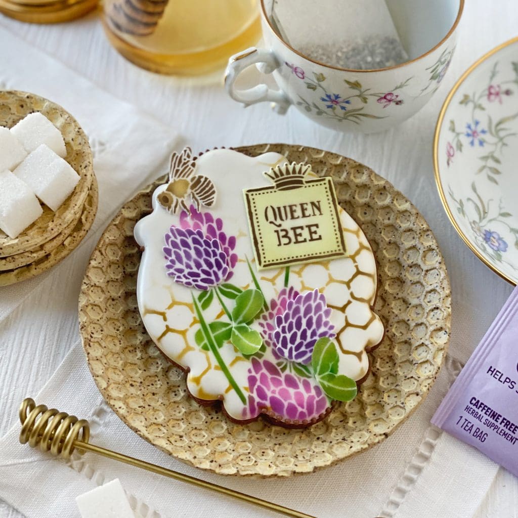
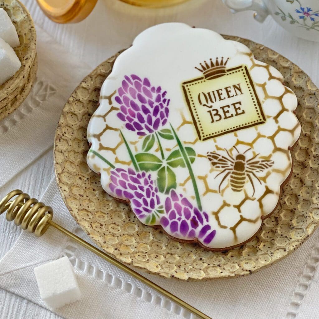
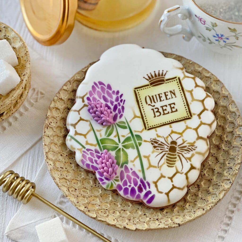
And, last, I have for you three cookies that use the “QUEEN BEE” message (which is suitable any time of year), starting first with one where every element is directly airbrushed on the cookie and ending with another that is decorated almost exclusively with dimensional elements, including those famous rice paper wings!
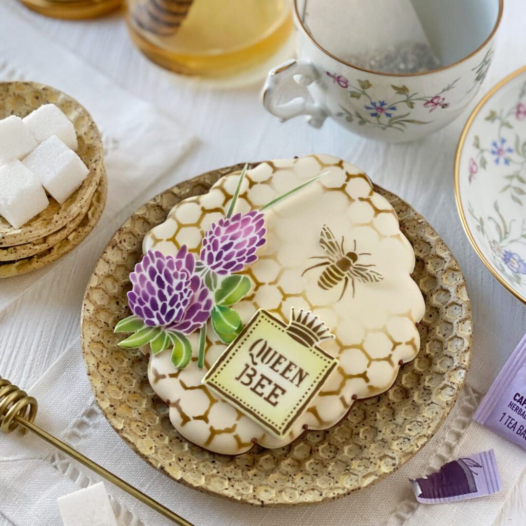
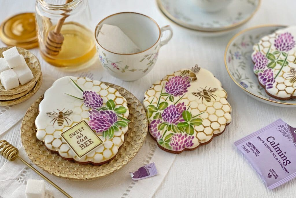
And that’s a wrap! I hope I’ve given you enough inspiration to get your own sets started. But before you make a beeline to Confection Couture Stencils to shop (![]() pun intended), I leave you with my usual parting “summary” photo showing different elements and techniques, as well as a list of key links. May you find that you and and my February stencil release were meant to bee! (Tee hee! How punny!)
pun intended), I leave you with my usual parting “summary” photo showing different elements and techniques, as well as a list of key links. May you find that you and and my February stencil release were meant to bee! (Tee hee! How punny!)
If you have any technical questions about these stencils, just email me at sweetlife@juliausher.com or leave a comment below. Please, however, direct all ordering and Stencil of the Month Club questions to my stencil partner, Confection Couture Stencils, at service@confectioncouturestencils.com. Thank you!


Be the first to hear about my latest events, tutorials, and product announcements by subscribing to my newsletter!
Schedule willing, I release one each month, roughly mid-month. And, guess what else?! Once you subscribe, you’ll receive a special one-time coupon code for 20% off my online tutorials. The code will be delivered in your subscription confirmation email, so keep your eyes peeled (as it cannot be resent). Thanks in advance for subscribing!
Live sweetly, Julia