
Still recovering from Christmas? Weary of party after same-old party? On the verge of drafting a New Year’s resolution vowing never to entertain again?
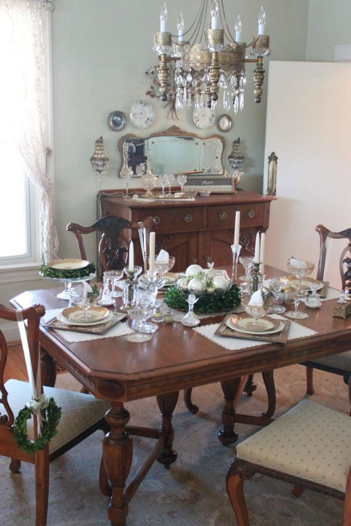
Hold on – don’t be rash! I know all too well the consequences of holiday party-planning burnout – and they’re not pretty! Foregoing good times with friends and family out of fear of more dishes, lack of novel decorating ideas, or even shortage of cash usually isn’t the right trade-off. Even now with a few days ‘til New Year’s, it’s not too late to give your holiday table some special design twists that won’t break the bank – or your back. With some thoughtful rearranging and re-purposing of things you already have, it’s possible to create an entirely new, and impressive, party ambience in much less time than you might think.
In this post, I share my top 10 tips for holiday tabletop design – basically those tricks I apply when I need to change things up fast, yet still make a statement. I started with a bare dining room table just a few hours before I took the photos to the right. While there were moments when the room looked like a tornado had ripped through it (scavenging through cabinets and drawers for the “right” accessories can get messy), I calmly welcomed guests later that night, thanks to these 10 design guideposts. Listed in no particular order, they are . . .

OK, OK, so this isn’t a table design tip per se, but the number of guests seriously impacts the scope of any design, and so this tip needs to be taken seriously. If you’re already stressed out or on the verge of going over the edge, then seriously consider inviting only your favorite family or friends. It can be tough to draw this line (I know, this table – photo 1 – is set for only four), but I have found time and time again that the most memorable events have been those where I’ve had the time for real, in-depth conversations with my guests.
This is the messy part to which I alluded earlier. But in the early stages of decorating, I find it easier to visualize the end result if all or most of the possible design elements are in plain view. At least rumble through your cabinets to remind yourself of what you have. It also helps to choose a common theme among those elements to guide your decorating choices along the way. I happen to have an accumulation of mismatched gold-rimmed plates and crystal stemware, which seemed suitably sparkly for my New Year’s gathering. Plus, my dining room walls are a soft apple green. So I quickly settled on a “gold and glass with touches of green” theme.
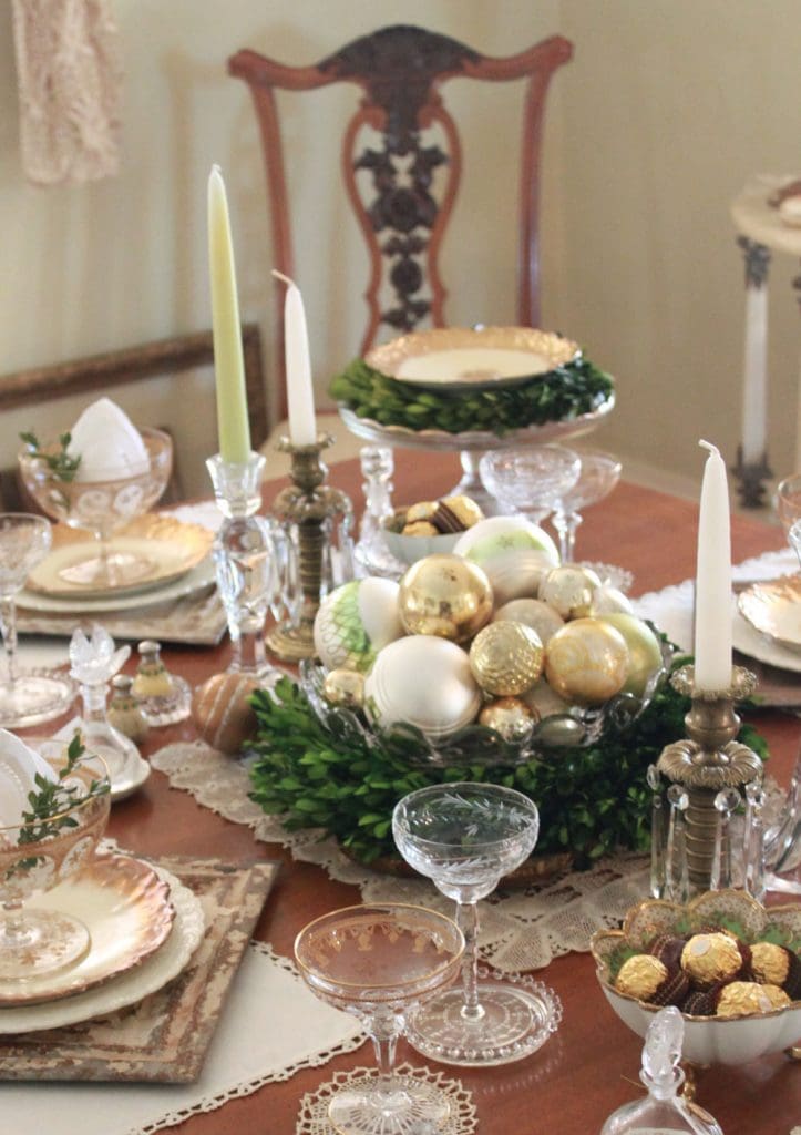
If you’ve got a fairly general or abstract theme, as I did, it’s particularly nice to throw in some design elements that are suggestive of the season. After all, we’re talking about holiday entertaining! To this end, I drew on my stash of green and gold Christmas ornaments and arranged them, along with a fresh boxwood wreath (left over from my outside decorating), in a fancy bowl. The result: a showy, but super simple centerpiece (photos 2 and 3).
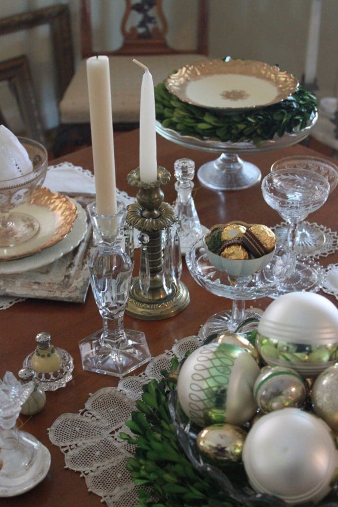
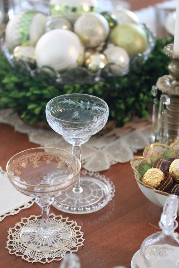
When you’re drawing on an existing reserve of dinnerware and other table stuff, it’s unlikely that you’re ever going to have complete matched sets of everything you need. At least, that’s the case for me! But, no worries. Mixing and matching can add interest to a table, especially if you’re working within the constraints of a reasonably tight color palette. Cases in point: my mismatched stemware (photo 5) and candlesticks (photo 6). While different patterns and shapes, they fit harmoniously into my gold and glass theme. This all said, beware of mixing and matching too much – i.e., patterns, colors, materials, and shapes. There needs to be some thread of commonality among design elements to make the final design sing.
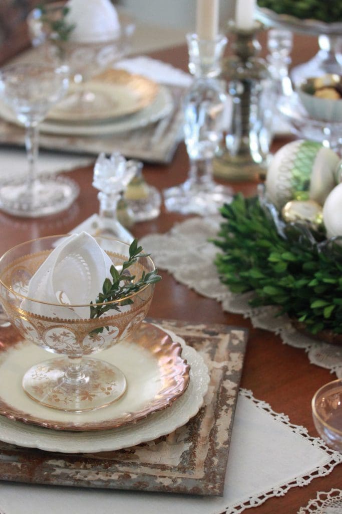
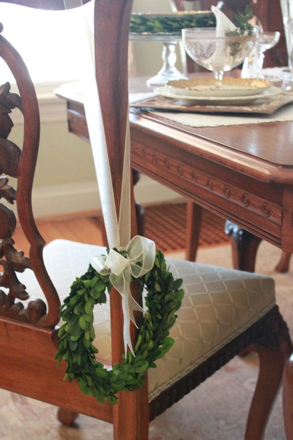
This tip is particularly important to heed if you’ve done a lot of mixing and matching. In addition to sticking to a tight color scheme, the repetition of one or more design elements can make disparate elements hang together more logically. For instance, I repeated the dark green accent wreaths in a number of areas for this reason: in the centerpiece, as a charger on a cake stand (photo 3, left), and as chair-back embellishments (photos 1 and 4).
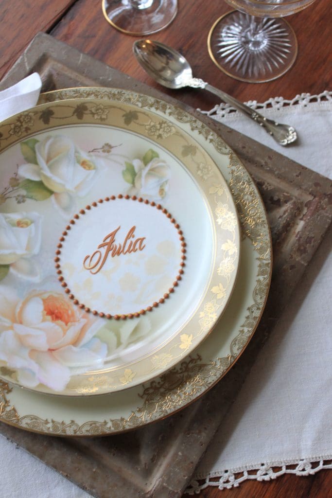
I’ve always been a proponent of place mats and chargers. They ooze extravagance and suggest special attention lavished on guests – both of which are perfectly well and good provided these accessories are actually not extravagant! Here (photo 7), I created a sense of formality by layering my hodge-podge of inexpensive china on flea-market tin tile “chargers.” This unexpected juxtaposition of refined and weathered is also a sure-fire conversation starter.
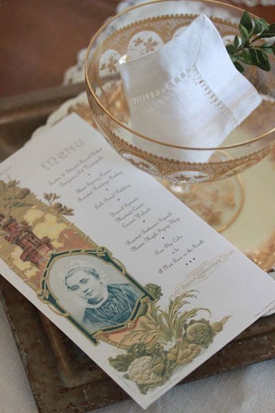
Details matter when it comes to memorable entertaining, and none more so than the menu. Guests these days are more tuned into their food than ever – they want to know where it came from, how it was prepped, and exactly what’s in it. So why not save some time repeating yourself by spelling it all out on paper? Plus, a beautiful menu can double as keepsake party favor. “Memorializing the menu” doesn’t have to be an all-day or all-week proposition either. I’m not sure when I first started scavenging for vintage menus, but I’ve been doing it for a while – and for good reason. They offer rarely before-seen, ready-made backdrops (photo 8) that can quickly be turned into new menus with a scanner and a little Photoshop.
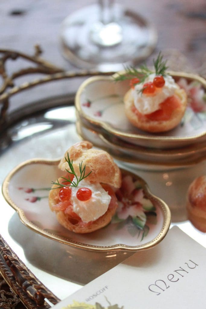
Just as the menu is an important design detail, so too is the food. It, of course, needs to taste great first and foremost, but also think about how its style, colors, and presentation fit the mood that you’ve set with the rest of your décor. While we often strive for a lot of color in food, I purposely chose a more neutral palette (as in my puffs, photo 9) to complement my dishware and place settings. A delicate sprig of dill on each puff gives it the necessary color boost, while tying to the green in the tabletop and chair-back wreaths.
Guests like to know that their presence at your table is important – it’s that simple! And one of the best ways to show you care is by personalizing their experience with one-of-kind place cards. Place cards are a practical solution (people naturally want to know where to sit), but they can also be meaningful gifts if crafted with originality and flair.
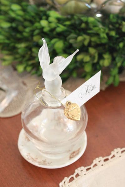
For this party’s place cards, I strung name tags and charms around the necks of inexpensive perfume bottles (photo 10) and then filled them with after-dinner aperitifs. Everyone quaffed on the spot, but the bottles were taken home as lasting memories of the event.
Don’t have any bottles handy? Don’t fret. Place cards can be original in so many ways – just think about what you have handy, and get creative. Had my bottles not worked out, I would have resorted to Plan B (photo 11), which relies on frosting sheets and icing, things I use everyday! (P.S. Coming soon – video tutorials about how to make both of these place cards! Stay tuned.)
As for other details, I believe it was Ludwig Mies Van Der Rohe who said “God is in the details,” and, boy, was he ever right! Little touches add up and are often what elevate a party from nice to spectacular. But tending to every tiny detail can quickly get overwhelming even if your guest list is short. After taking care of the basic tabletop décor and menu, I typically limit my design time to two or three other details. And I always (and I mean always) make sure those details serve more than one purpose; that way, I get more mileage out of my limited time.
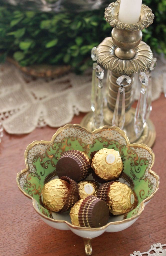
So, for example, my perfume bottle place cards were not just place cards; they were also a drinkable part of the menu and a take-home gift! (I think this qualifies as triple duty, right?!) Another example: I placed gold paper-covered chocolates in bowls flanking the centerpiece (photo 12). A random last-minute thought? Not at all. I used them to extend both the centerpiece (when I realized I didn’t have enough ornaments) and the meal (just in case we wanted to linger before dessert)!
And, on that note, I conclude my 10 tips! To recap: Rely on things you already have, shake them up a bit so you land on a new design twist, and leave yourself plenty of time to ring in the New Year with a glass (or two or three . . . ) of champagne! Happy 2014!
Be the first to hear about my latest events, tutorials, and product announcements by subscribing to my newsletter!
Schedule willing, I release one each month, roughly mid-month. And, guess what else?! Once you subscribe, you’ll receive a special one-time coupon code for 20% off my online tutorials. The code will be delivered in your subscription confirmation email, so keep your eyes peeled (as it cannot be resent). Thanks in advance for subscribing!
Live sweetly, Julia