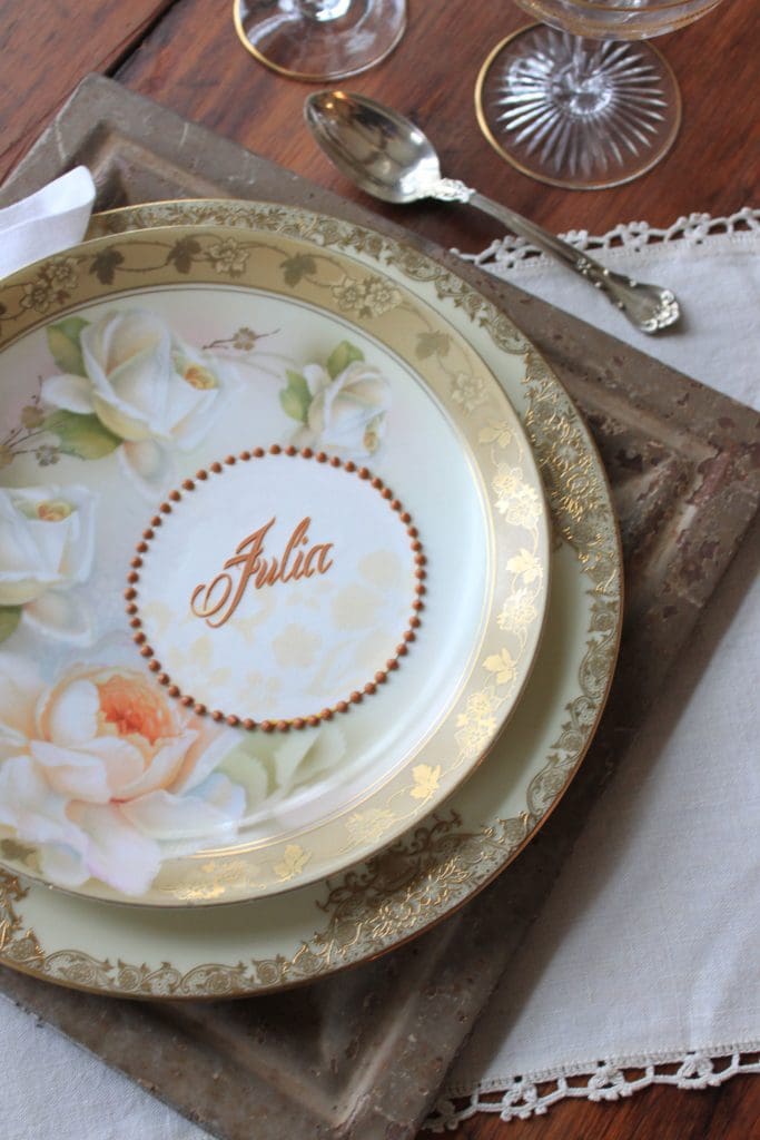
For these edible place cards, Julia was careful to choose icing colors that coordinated with the cream, gold, and peach in her gorgeous rose plates. Brown is always a great choice if you’re going for a vintage look as Julia was here, because it tends to ground colors that might otherwise be too vibrant. Another trick: weave similar design elements throughout your place settings to ensure a cohesive look. Notice how Julia airbrushed a subtle floral pattern behind her name to mimic the trim on the plates? That small touch somehow brings everything all together. Want the step-by-step instructions for this simple, but striking project? Then check out Julia’s YouTube channel!
Be the first to hear about my latest events, tutorials, and product announcements by subscribing to my newsletter!
Schedule willing, I release one each month, roughly mid-month. And, guess what else?! Once you subscribe, you’ll receive a special one-time coupon code for 20% off my online tutorials. The code will be delivered in your subscription confirmation email, so keep your eyes peeled (as it cannot be resent). Thanks in advance for subscribing!